

Megafon Rebranding
A Quick Look Into the Competition

When you strip down all marketing messages from a piece of OOH, ultimately you're left with the most essential design blocks of the brand which is the branding elements. Here's a study of what MTS and Beeline was doing at the time. Please note that this is for illustration purposes only and do not reflect the actual branding principles of the companies mentioned.
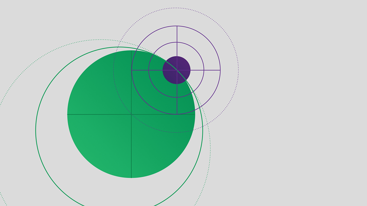
Working with a Universal Symbol

The circle is a universal symbol with extensive meaning. It represents the notions of totality, wholeness, original perfection, the Self, the infinite, eternity, timelessness, all cyclic movement, God ('God is a circle whose centre is everywhere and whose circumference is nowhere' (Hermes Trismegistus)). As the sun, it is masculine power; as the soul and as encircling waters, it is the feminine maternal principle. "It implies an idea of movement, and symbolizes the cycle of time, the per petual motion of everything that moves, the planets' journey around the sun (the circle of the zodiac), the great rhythm of the universe. The circle is also zero in our system of numbering, and symbolizes potential, or the embryo. It has a magical value as a protective agent, ... and indicates the end of the process of individuation, of striving towards a psychic wholeness and self-realization" (Julien, 71).
With the number ten, symbolizes heaven and perfection as well as eternity. In Jung, the antithesis of the square (lowest state of man who has not achieved inner perfection), standing for the ultimate state of Oneness, with octagon in between. Circle of Necessity: birth, growth, decline, death. Defense against chaos, formlessness. - Dictionary of Symbolism. Originally Constructed by Allison Protas
Augmented and refined by Geoff Brown and Jamie Smith in 1997 and by Eric Jaffe in 2001
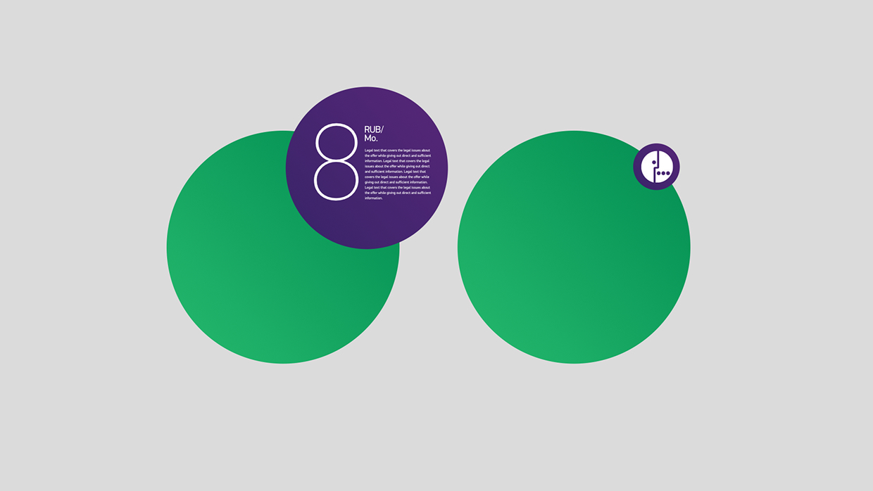
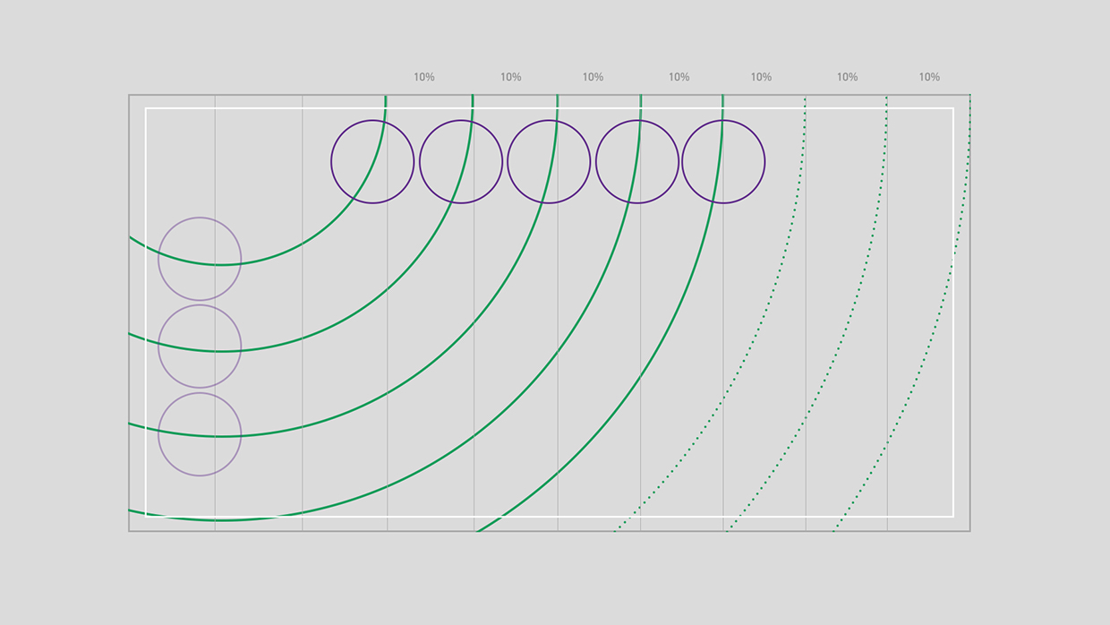
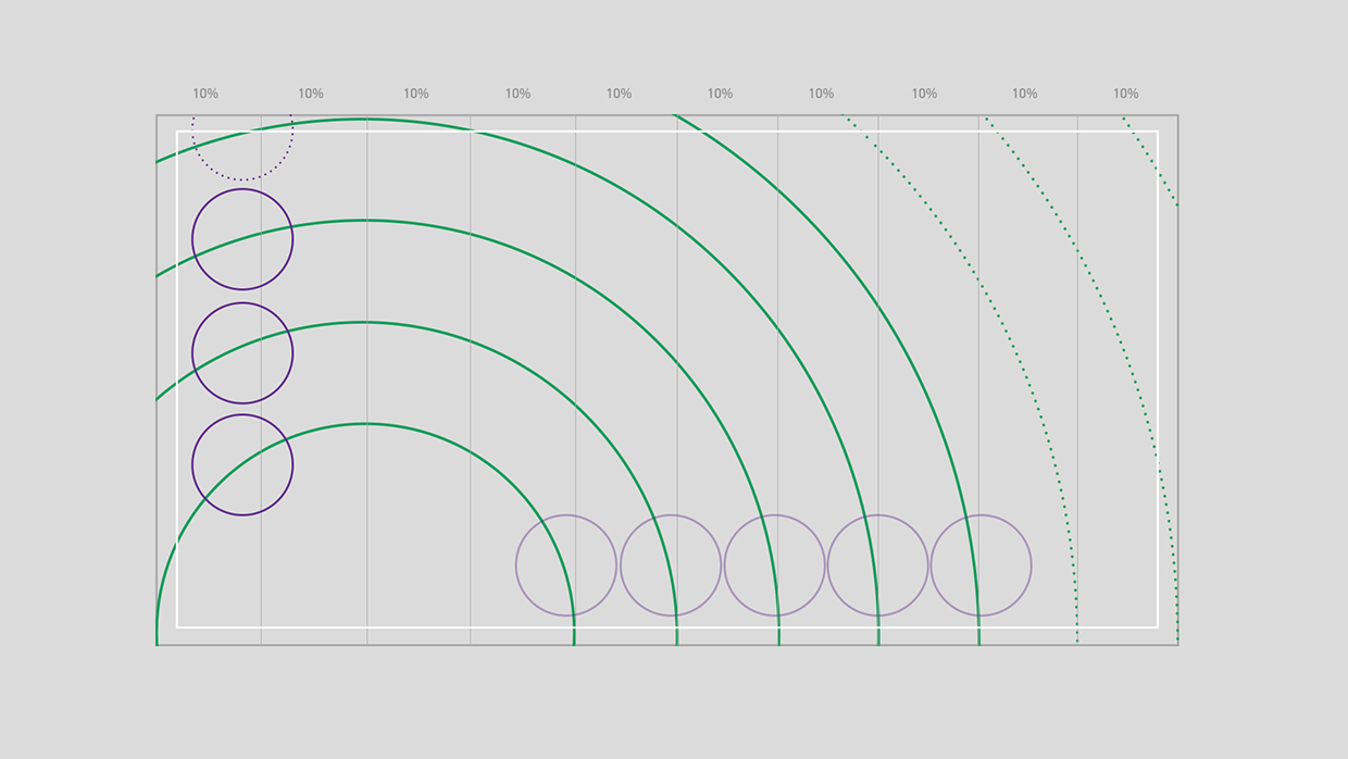
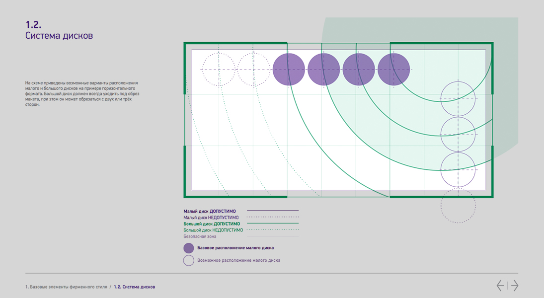
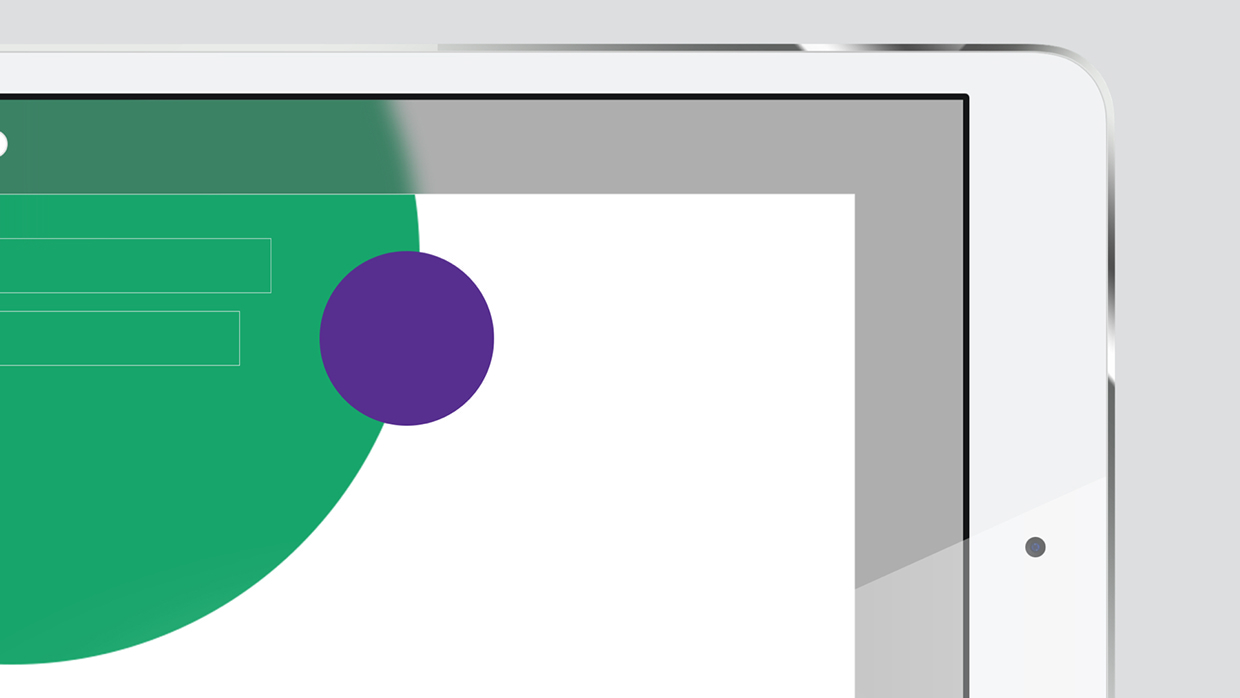
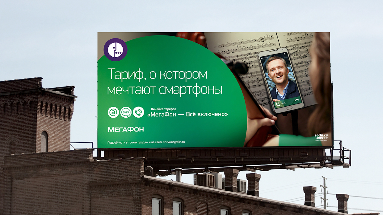
Modular System Takes Form Inline With the Content
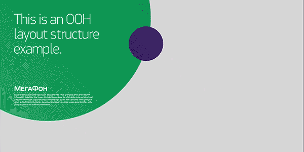
Modular System Takes Form Inline With the Content / I believe we had an unique approach since the first moment we decided to step in. Our square one was *a timeline*, not a static page. We literally developed the animation of how the elements moved and reacted to each other as we were developing those very elements. This helped a lot to understand the shape's characters and relationships.
In this new branding system, only the content decides how big the backdrop of the branding is gonna be in a particular layout. If the image want to have spotlight on it, the elements gets smaller to allow just that. If the layout is all about the text and the image should act as a background, the elements reshape themselves to accomplish that. This is why we call it "modular". This is why it works.
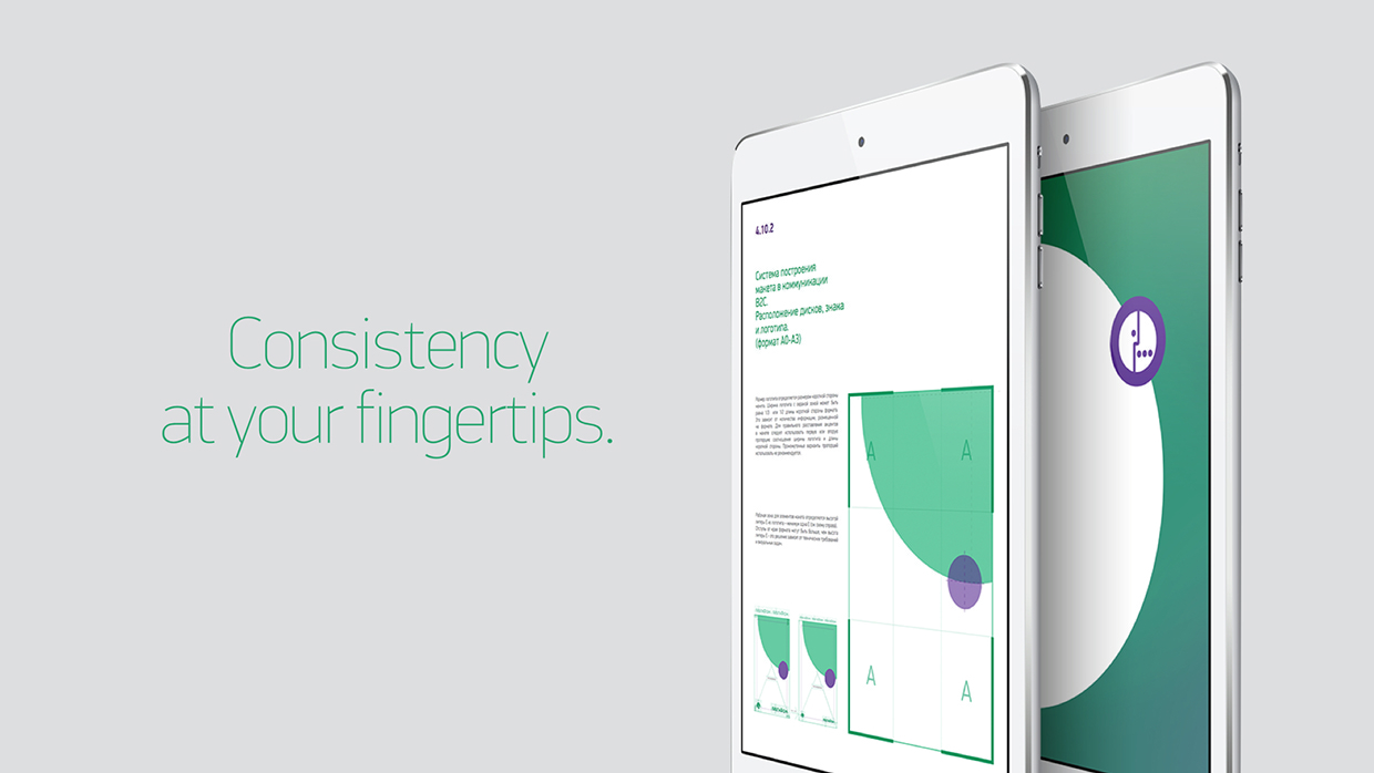
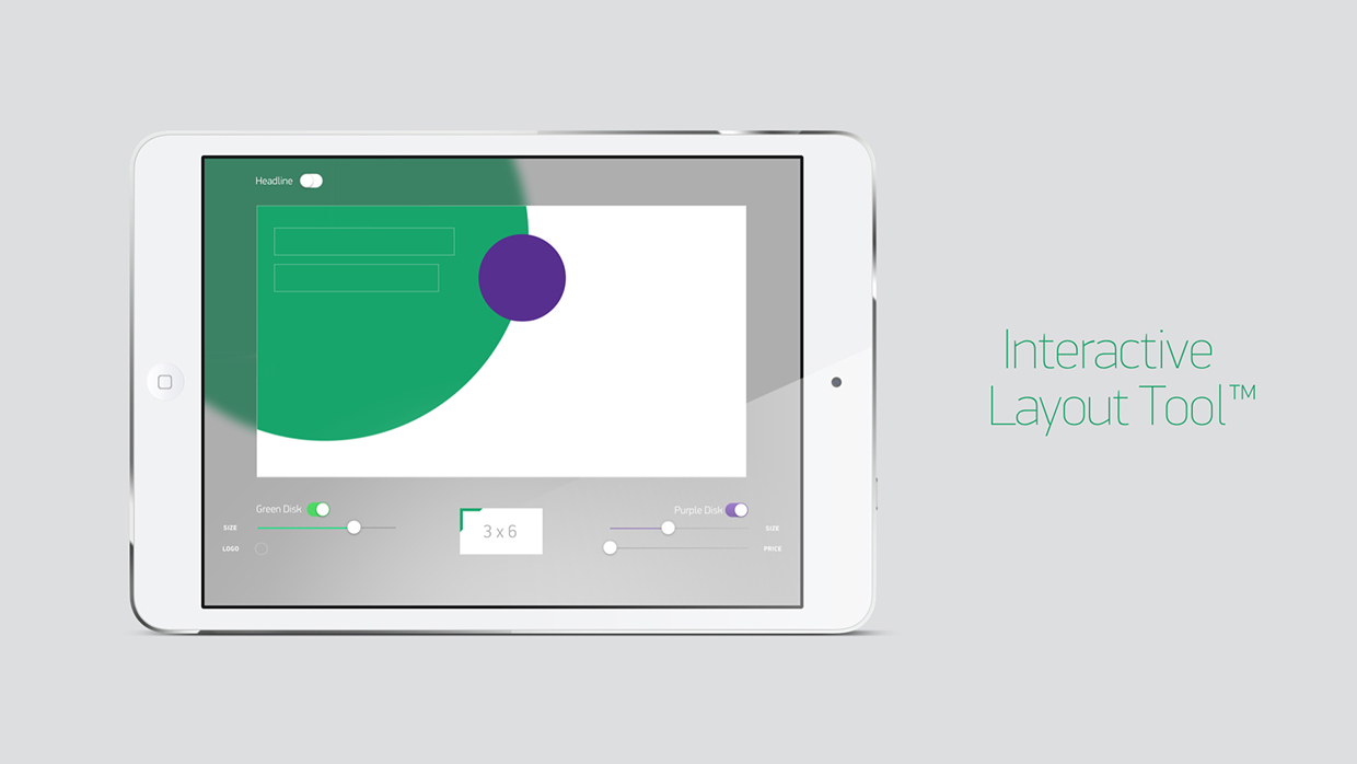
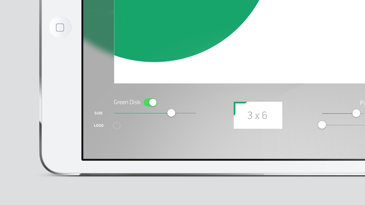
Being a telecommunications leader on this age brings numerous responsibilities as well as opportunities. We did not stop at just creating a modular system for the brand, we wanted to expand this thinking onto the brandbook leg as well. That's why we have created a digital brandbook concept where an "interactive layout tool" was introduced alongside the standard contents of a brandbook. The app makes it easy to update and distribute data to all corners of Russia. This part of the work is under development.
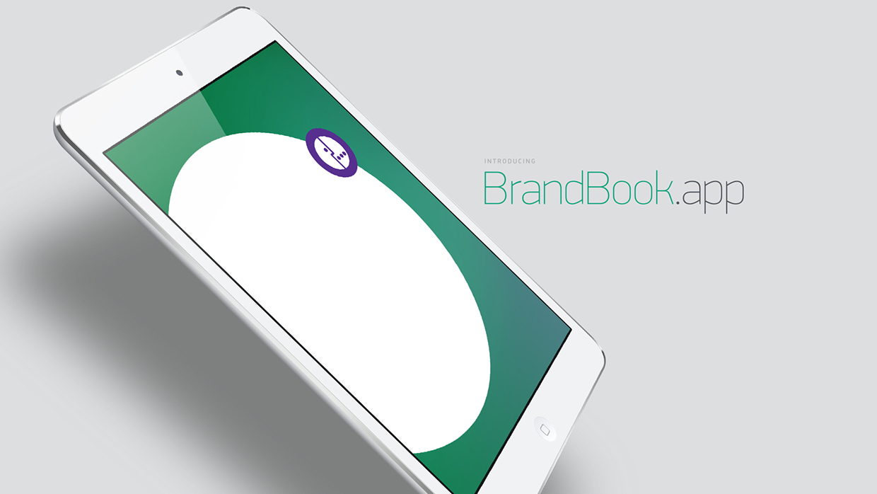
A Brandbook for the Digital Age
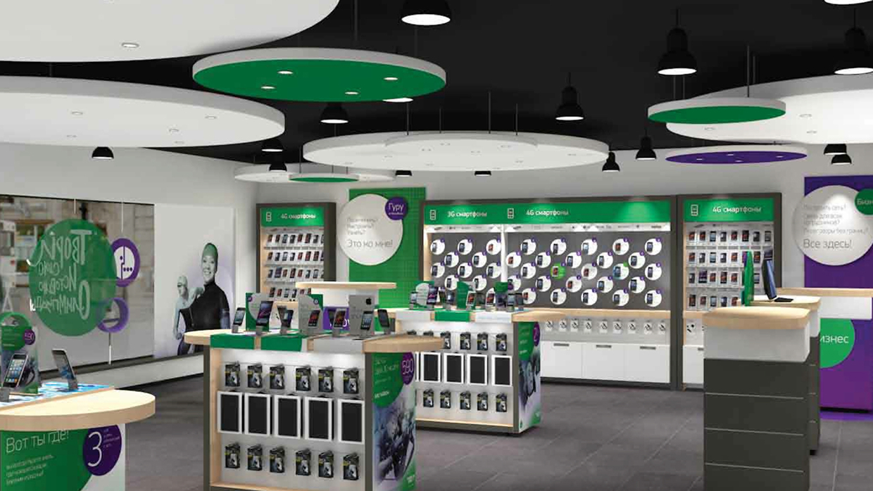
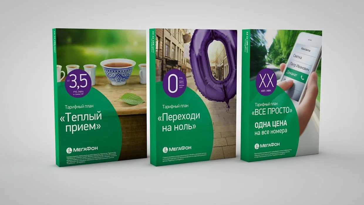
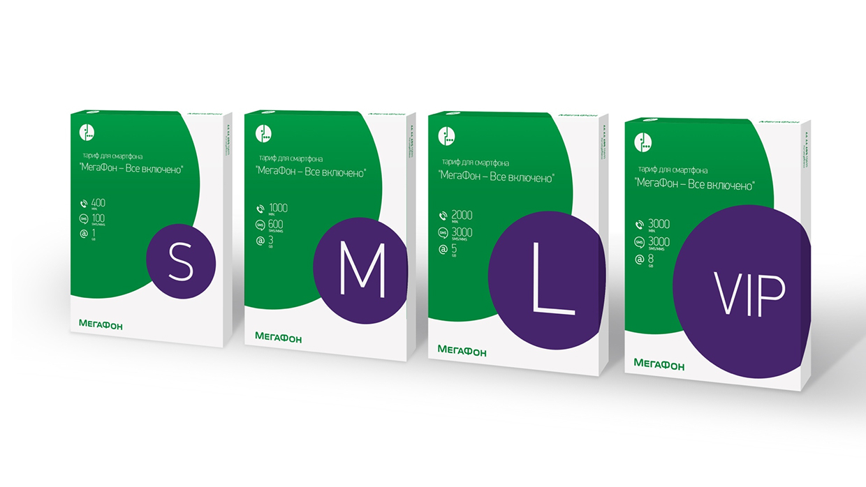
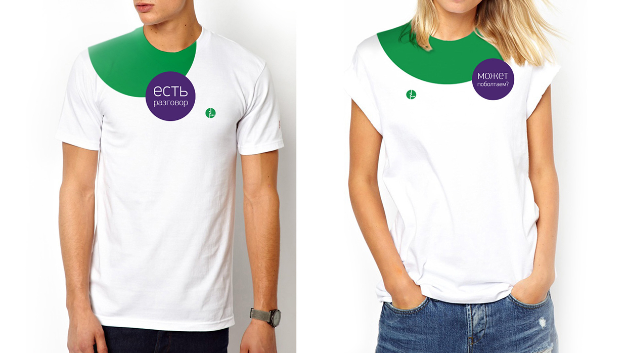
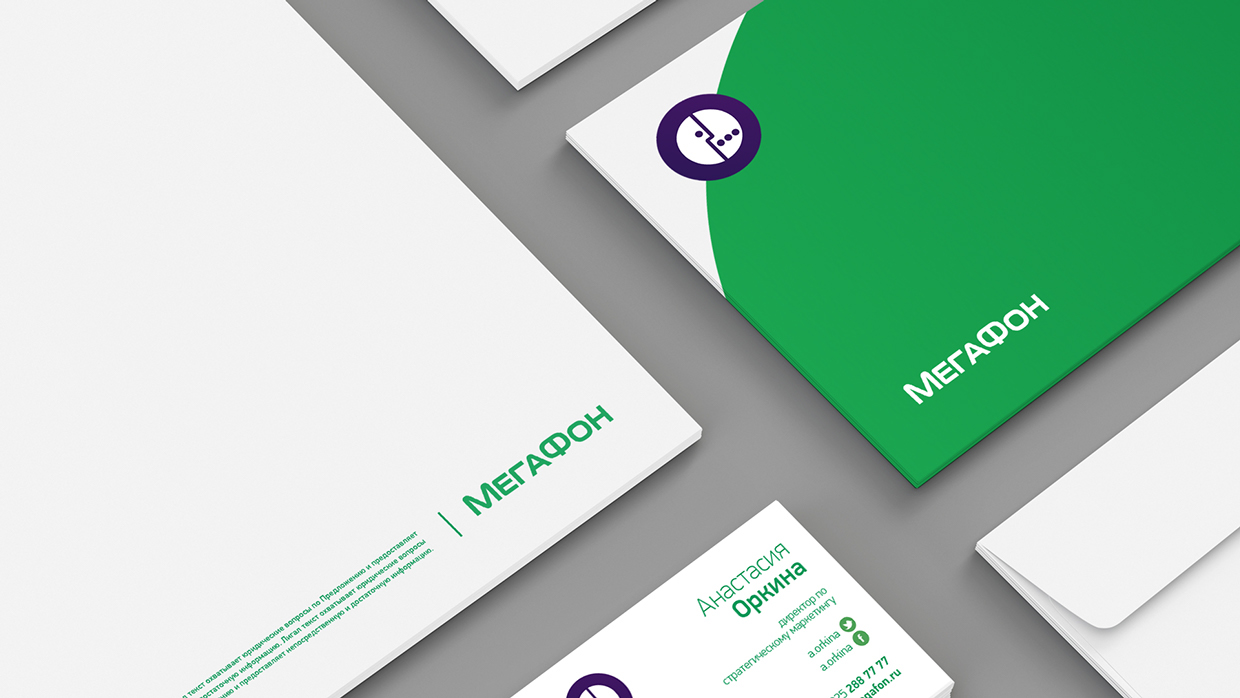
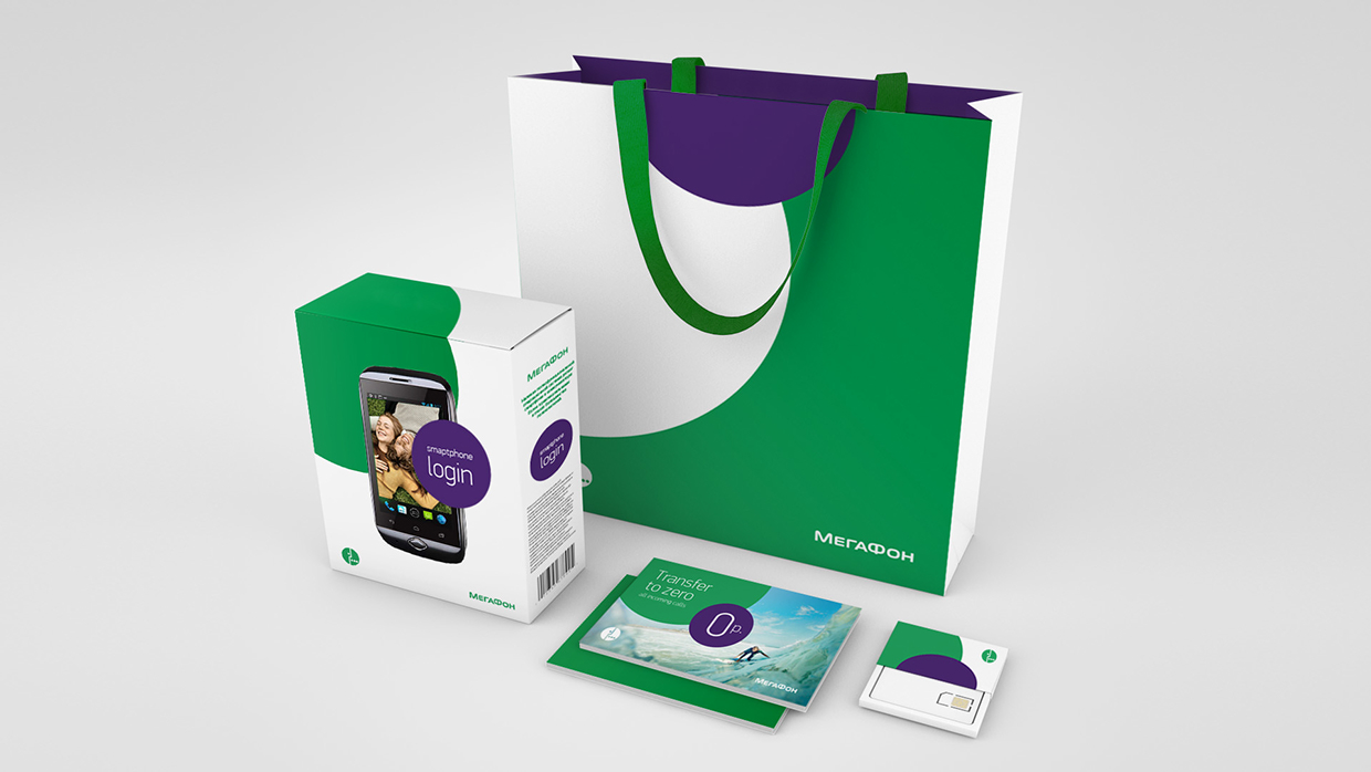
Different Canvases Give Life to the Brand
From a 40 m. wide wall to a 4 cm badge and anything in between. This is where the brand lives. There are literally hundreds of materials designed. Below you can enjoy a handful of them showing how the system lives on various places. Some are on a concept level, some are out on the streets already.

Credits /
Main Concept and Implementation: Leo Burnett Moscow
Idea, Design Lead and Creative Director: Selim Ünlüsoy
Technical Design Lead: Olga Kavun
Designer: Margarita Akimova
Designer: Taisiya Ganzha
3D Designer for Showcase: Sergey Vasyanin
Account Group Director: Alena Vilke
Senior Account Manager: Ekaterina Kislova
Print Master: Dmitry Chelnokov
Retail Design and Consultancy: Saffron Brand Consultants
Executive Creative Director: Gabor Schreier
Executive Director: Luz Erhardt
Design Director: Matt Atchison
Client: MegaFon Russia
Executive Director of Business Development: Mikhail Dubin
Director of Strategic Marketing: Anastasia Orkina
Head of Brand and IMC: Olga Khariybina
Manager of Marketing Comm.: Andrew Litvinov
Brand Studio Specialist: Alexey Savin

